Precision-recall versus ROC curves for rare outcomes
In this article (5 sections)
ROC curves compare true-positive and false-positive rates across thresholds. Precision–recall curves show how many positives are found and how many selected cases are actually positive. For rare outcomes, the latter often makes review workload easier to understand, while ROC still supplies useful class-conditional ranking information.
An original controlled example shows the difference without training a model. Start with twenty positive and 980 negative observations and fixed authored scores. Then repeat every negative observation ten times while keeping the twenty positives unchanged.
Change prevalence while preserving conditional scores
The original prevalence is 2%. The expanded dataset has twenty positives among 9,820 rows, approximately 0.204%. Every negative score occurs ten times as often, so the score distribution conditional on the negative class is unchanged. The positive-class distribution is unchanged too.
Consequently, ROC AUC remains approximately 0.988776. At threshold 0.5, recall stays at80%, but false positives increase from ten to one hundred. Precision falls from 16/26=61.54% to16/116=13.79%.
This is a constructed prevalence change, not evidence that real-world score distributions remain stable during a population shift.
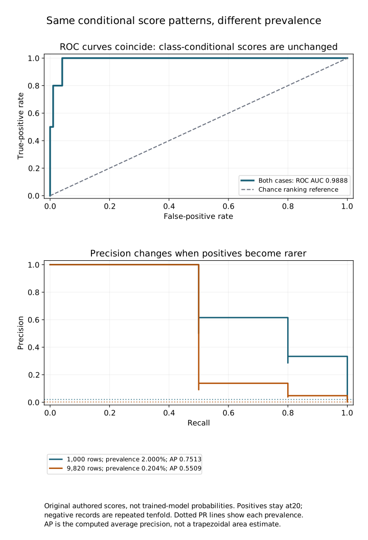
Open the full-size SVG for zooming. Dotted horizontal lines in the lower panel mark each prevalence. The figure uses original authored scores, not measured production predictions.
Verify the calculations
import numpy as np
from metric_cases import rare_case

r = rare_case()
original = r['original']
rarer = r['tenfold_negative_counts']
assert original['n']==1000 and rarer['n']==9820
assert original['positive_count']==rarer['positive_count']==20
assert np.isclose(original['roc_auc'],rarer['roc_auc'])
assert original['recall']==rarer['recall']==.8
assert np.isclose(original['precision'],16/26)
assert np.isclose(rarer['precision'],16/116)
assert np.isclose(original['average_precision'],.7512820512820513)
assert np.isclose(rarer['average_precision'],.5509031198686372)
print({'original':original,'rarer':rarer})
The evaluation lab includes the score generator, curve coordinates and rendering script. Average precision is calculated from threshold-based precision–recall changes. It is not labelled as a trapezoidal area under the plotted steps.
Scikit-learn's precision–recall curve reference documents the curve outputs and endpoint behavior. Preserve those conventions when matching thresholds to points.
Interpret the denominators
False-positive rate divides false positives by all negatives. Precision divides true positives by all positive predictions. When negatives are numerous, a small fraction of them can still create many false alarms relative to the number of true positives.
This explains why a strong-looking ROC curve can coexist with a demanding review queue. It does not make ROC incorrect. The metrics answer different questions, and the relevant operating region matters more than a single full-curve summary.
Compare models on a comparable population
Average precision depends on prevalence, so comparing its value across datasets with different class mixtures needs context. Report prevalence, counts, the target definition and the evaluation sampling scheme alongside the score.
If evaluation deliberately oversamples positives, precision on that sample is not automatically deployment precision. Recovering an operational estimate requires justified weighting or a representative evaluation design, not an undocumented adjustment.
Exercise: multiply the negative count by five instead of ten. Verify which threshold rates stay fixed and calculate the selected-case workload. Explain what would invalidate this prevalence-only extrapolation in a real deployment.
NeuraPath's Data Science course connects ranking metrics with practical error analysis. Report the curve, population and operating-point counts that support the decision you are asking a stakeholder to make.
Continue learning
This article is part of the Machine learning workflow and evaluation sequence. Use the neighbouring tasks when you need the prerequisite or the next application.
- Review the prerequisite or neighbouring task in Confusion matrices at more than one threshold.
- Continue with Nested cross-validation: separate tuning from assessment.
Pankit Kumar has 10 years in Data Science & AI, building and shipping production systems in regulated pharma and clinical environments. He is a freelance trainer at Boston Institute of Analytics, AnalytixLabs and Scaler, and has taught this material to thousands of working professionals.
This article is part of our Data Science programme — 6 months. From data foundations to machine learning, deep learning and deployment.
Explore Data Science